UX Designer and Researcher

cuisineconnect
Step One - Understanding Context of Use
To begin our project, my team members and I brainstormed ideas about an issue our platform could potentially mitigate, and what communities we were hoping to serve. After identifying our user group, we conducted interviews on individuals who we thought fit our user profile. Based on the information we gathered from these interviews, we then made user personas and user journey maps to better empathize and understand our potential users. The ones that I created are below and were created in Adobe Photoshop.


Step Two - Structuring Content
We then ran card sorting and tree testing studies to help us design our platforms information architecture. These studies were ran in optimal workshop and completed by participants that fit our ideal user group. We then used our findings to construct a site map, which helped us then create wireframes.

Step Three - Low Fidelity Wireframes
From our site map and testing we were able to begin designing wireframes in Figma for both an app and desktop version of our platform. We then tested these designs by having particpants complete two tasks while using our prototype. This enabled us to see what features were discoverable versus which were not, and to see the overall usability of our design.


Step Four - High Fidelity Prototypes
Based on the results we got from our wireframing testing, we were able to identify user pain points and redesign to mitigate them. We went through mulitple designs iterations and tests before ending up with our final product. We then presented this prototype to our class in a stake holder style layout, as we were graded by our classmates as well as our professor.


Step Five - Design Reflection
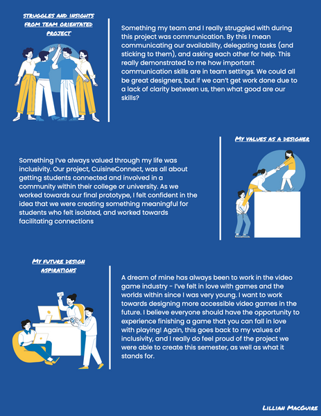
For the final assignment of this project and my class, I was individually tasked with creating a visually engaging design reflection. In this, I reflected on readings I completed during the class and what I learned from them, as well as what I learned from my first UX project.

